

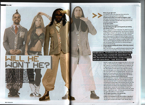
I really like this double-page spread especially because of one of the pages being completely of an image. I also really like the colours, I think red black and white really work well with each other and contrast very well. It's quite plain however still works and stands out. Personally from looking at the image and the pose of the model I think the audience would be of an younger age rather than the older generation, more teenagers would read it. My idea doesn't include just one picture on a page as I wan't more writing and more than one picture however this is definitely one of my favourites.
I don't really like the colours on this double-page as I think they are pretty plain however it does work well with the layout, just with my magazine I wan't it to be very different to this, I wan't mine to be very colourful. I also really like how the font, in the middle of the page turned from black with a white background to a white with a black background,I think it looks really good and artistic even though it is just the simple colours and I think I may even use this in my magazine.

I don't really like the article font as it looks too plain and a lot like a news paper however the masthead is veyr interseting and caught my attention, I think this happened with a lot of people also as I know many people have used it. I quite like how there is just three colours used however I think they are a bit too dull. I also really like how the larger writing is a quote from the model and that's what I want to do with my double page however smaller as I want the title too stand out a lot more than the quote or quotes.
No comments:
Post a Comment