Friday 28 January 2011

artist profile.

name;Natasha Yates
performingname;NY
age;18
songs released;never again-why me-broken trust-freshstart.
gigs;clubs in hometown-supporting Example in 2011.
albumsreleased;never again-January2011.
rolemodels;jessie j-ke$ha-professorgreen.
likes;dancing-singing-fashion-clubbing-family-friends-sports.
dislikes;silence-being away from home.

Monday 24 January 2011

inspiration.

From the first image I saw of Iain Crawfords, I knew I wanted to use him as my inspiration for my images, although his pictures have obviously took a lot of time and years of practice which I havent't got. His images are very bright and creative and many different colours are used. Some of them are quite mad and crazy personally too much, almost as if he had ran out of ideas of what to do he just threw something together which I don't really like (the swimming hat images) although my top rated are definetly the paint threw images, these are most of the images. If i had the time and equipment i would definetly do the paint effect image as I think it really stands out, different and would get peoples attention.

Wednesday 19 January 2011

colour pallet.

I made this colour pallet with not a very wide variety of colours, these colours will run through out my magazine, however I may not use all of them, I think the font's will be black and the colours will relate to the images. The colours are quite unisex however mostly masculine.

audience profile.

The target audience I am going for are male & female ages around 15 to about 22, the main reason for this is because I don't want it too be limited, if it was just a female magazine not as many people would buy it and it wouldn't appeal to everyone. However as my magazine cover is a special edition on just a female people could get the idea it's just for males however I don't want this to happen, so will try and put in some masculine subjects. Because the genre of music is quite a range I think this will be very appealing to people, as I'm trying to make it quite new however 'old skool' also so many people may read it because of the differences. Also the fact I am using fashion in the magazine gives it more of a variety and a bigger set audience.


name; Charlotte Dunmore.
age;16.
gender;female.
studies; health&social-travel&tourism-art-maths.
music;pop-r'n'b-indie.
artists/bands;justinbieber-jls-mcfly-kasabian-articmonkeys-snowpatrol.
likes;music-fashion-food-photography-livemusic.
dislikes;spiders-screamorock-mushrooms.


Opinion on the blog/magazine/photgraphs;
'I really like the ideas of the article 'Two Lives' because it shows Jodie has put a lot of thought into it, and it's definetly something I would buy to read. I like the colours what she has used for the title and how it links into the pictures. I don't really like the theme of the music because I don't really listen to that, however the magazine(ideas) look very interesting so this is one reason it interests me.'


name; Louise Riddle
age;16.
gender;female.
studies; travel&tourism-ict-maths.
music;pop-anything really.
artists/bands;cherly cole-jls-kyleminogue-scoutingforgirls.
likes;music;sleeping-animals-magazines.
dislikes;spiders-peas-drunkpeople.


Opinion on the blog/magazine/photgraphs;
'I think the photo's are very creative, of what i have seen. I think the blog is very eye catching, nice bright colours which is nice to look at it, it links very well with the theme of the magazine. I don't really like the genre of music as I don't really listen to that sort, however the magazine still does interest me.'

rough idea- article.

The title of my article is going to be called 'Two Lifes' the reason for this being is because the artist I have made up is just an 18 year old, college girl unknown to the music industry however has just been noticed and is now hopefully now an upcoming music artist. So I done an interview on both of her lives, one being the normal and the other music. Her name in real life is Natasha Yates and her music name is NY, this is described in the article on why she chose the 'NY' which is not just her initials, but actually means something. One part of the page being NY and the other Natasha Yates, these being seperated by a zig zag 'tear' and being 'taped' up by pictures of both the 'people' however not too parted as I don't want to seperate them too much, then with an interview.

Tuesday 18 January 2011

double page spreads.


I really like this double-page spread especially because of one of the pages being completely of an image. I also really like the colours, I think red black and white really work well with each other and contrast very well. It's quite plain however still works and stands out. Personally from looking at the image and the pose of the model I think the audience would be of an younger age rather than the older generation, more teenagers would read it. My idea doesn't include just one picture on a page as I wan't more writing and more than one picture however this is definitely one of my favourites.

I don't really like the colours on this double-page as I think they are pretty plain however it does work well with the layout, just with my magazine I wan't it to be very different to this, I wan't mine to be very colourful. I also really like how the font, in the middle of the page turned from black with a white background to a white with a black background,I think it looks really good and artistic even though it is just the simple colours and I think I may even use this in my magazine.

I don't really like the article font as it looks too plain and a lot like a news paper however the masthead is veyr interseting and caught my attention, I think this happened with a lot of people also as I know many people have used it. I quite like how there is just three colours used however I think they are a bit too dull. I also really like how the larger writing is a quote from the model and that's what I want to do with my double page however smaller as I want the title too stand out a lot more than the quote or quotes.

test shots.

I did these test shots around school, with a fujifilm finepix S1700 camera. The photos are of my friends and family as the model was not available at the time, and i needed to get use to the camera. I told the models to do the poses and where to stand and i used different locations to get an idea of what i wanted.

Monday 17 January 2011

magazine mockups.


Front Cover; Although this is just a simple title and image design I think it is already quite effective as the colours stand out and grab your attention, that is what I wan't my real magazine design to do. I also really like the pose the model is doing here, and will take into account when I am taking photos of my model.

Front-Cover'second edit; Although my mock up is quite plain, I wan't my magazine cover to be more busy, so it stands out more, not too much as it becomes messy but enough to catch the buyers attention. The barcode and price will be essential on my magazine to make it look professional and realistic, as will the masthead. I more than likely will put in a plug, this draws the readers in as something can be won. The title font I have used here, was from 'Dafont.com', I then coloured it in on paint, I will be using this exact one for my real magazine cover.
Contents; I really like the style of this contents, especially the masthead, and the title's down the side of the page, I think i will most likely use these as it suits the magazines needs by standing out and being bright, just like the masthead. The images at the bottom of the page are of 'dafont.com' and I think they fit in really well, I did try it with the colour scheme however the black and white work better together I think, I really like how it's quite simple however stands out and is just like an audio tape, cd player.
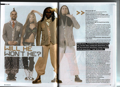
DoublePageSpread; The rip effect will definetly be used in my real magazine, I got the image of google however I will be taking the picture of a ripped peice of paper, this will most likely be a different colour to white as I can then change it to white on photoshop as it looks better and more professional. The reason I like it so much is because the title of the article is going to be called two lives, and with a rip down the page it splits the artist up into two, one being her perform and the other in 'real life'. I really like this double page however I think it's too plain, with my real one I want it to be stand out, my real images will do this and the title however i'm not sure on what font and colours I will be using there, and how I will use the colour scheme to not look messy. I wan't more going on with the page however not too crammed. I don't really like how I have done the overlapping images as I think it looks quite childish and collage like, I do like this effect however just not here. The big image is one of my real photo's for the magazine also the 'Never Again' one, the never again being her album, I have not chosen the final images for the magazine however I do have an idea.

Tuesday 11 January 2011

Contents Pages.


The reason I chose this contents page is because it stood out to me, and that's what I wan't mine to do. I really like the layout out of the page, especially the masthead, I like the font and how the white reflects of the black. There are five different colour fonts which I personally think is too much however it doesn't look a mess, the most important writing being the white which I think is good how they have done that. I also like the image at the top of the page, especially how it fit's along the top and isn't in the way of anything. However  I do wan't my title 'contents' at the top of the page, before any images or information because I think people should know what they are going to be reading about first of all. There is a lot of colours on the contents page which normally would of liked quite messy but I think it works really well, the pastel colours and then the quite bright coloured images attract the reader. I really like the fonts, they're not too childish however not too plain for the older generation which could mean the audience is an all rounder.                                   This is definetly one of my favourite magazine contents pages that I have seen in the shops and online, I really like how the image is the whole page and there is very little writing. I also really like the colour scheme, black and white really works together. The masthead being down the side I don't really like as I would prefer seeing it at the top however I do like how it is in a larger font than the rest of the writing. From what I can see the magazine could be an audience of female and male and more of a younger genertion rather than the old. The writing is quite plain, nothing fancy and that really goes with the page as it's just quite a dull black and white, with no colours it's quite boring like the font however I don't think it need's colour as this has a better effect.

I really like the layout of this contents page, especially how it has the photos down the side of the 'also in this issue' which i was thinking of doing, however maybe at the bottom. I think the colours match very well and there is just enough colour, not too much however not too dull. I don't really like the page number at the bottom as I think it draws too much attention too which is uneeded, it does this by being quite big. I really like the fon also and how the masthead goes with all of the other writing too, and how the titles have a black background behind them, I am definetly thinking of using this in my magazine as I think it makes them really stand out.

Magazine Pitch

Saturday 1 January 2011

NAME IDEAS.

The first name I came up with was 'Rewind' I thought it suited my magazine perfectly, the music and the scenes, my magazine consists of many different types of music including 'Old Skool' which where Rewind fit's in, however there was a problem- while researching images and ideas I came across a magazine with the title 'RWD' which also consists of the same music as me, so this really put me down as I don't wan't to come across I copied it. So I had to start over, I came up with ideas such as 'Fast Forward' 'Stop' 'Strike' 'Trash' 'Electro' 'Trashed'. The title 'Trash'/'Trashed' really stood out to me, I researched 'Trash Images' into google and found some really interesting photo's, some of which really inspired me.