Friday 17 December 2010

annotation

Magazine Cover

magazine covers.

I really like the colours on this magazine cover because there bright. If i was in a shop this would definetly stand out to me and that's what i want my magazine to do, catch people's attention, just enough so people will want too look at it. I really like the sqares effect, how all the pictures are sperated and different however they link together also. I do however think it is a bit too much, too much is going on and you can't actually see what the magazine is about, and that's what i want people to know about mine, what it's about and what's going on in it, then again people could be intrigued at the cover and then wan't too look inside more.


This is one of the best magazine covers i have came across, i really like the layout and i'm thinking about using my photo's like the magazine has done. I don't think enough information is given on the cover and think it would of been better if used as a backpage, however i still really like it. For example my magazine is one main genre however a few more also link into it so i could lot's of photo's of the artists who most stand out for my music.
Wired's robot
The reason I like this cover is because it's really different, I love the image how it's just lying there doing nothing, which is so simple however stands out so much. I also really like the fact that there isn't much writing on the page however I wouldn't like mine like that as I don't think there is enough information on the page. I wouldn't of thought yellow/orange and red would of gone too well together however I really think the colour scheme goes. One of my favourite things is definitely the masthead, I love how it's called 'Wired' and then there is an actual wire hanging the letters, I think that's very creative and that's what I wan't people to think of my title.

fonts.

I picked this font of 'dafont.com' I think it fits well with the genre quite ubeat and disco, i filled in the blocks on paint as i thought it was quite boring black and white, with the pink, purple and green it brings it to life, adds soul into it. It really reminds me of a dancefloor and with the music i am going to be doing my magazine on, gets people to dance, although it's not dance music it does all fit together. I wanted the title to stand out, be loud just like the music.

link to blog.

http://jodie-annkingmedia.blogspot.com/

Wednesday 15 December 2010

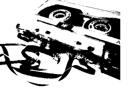
model ideas for magazine cover.


I really like the colours in this photo and the headphones, i really want my model to be wearing headphones as it links to the music.
This is my favourite model and i have been thinking that i want my model to be covered in tape, either caution tape or police tape, i think it makes a really good effect however i have got to have a reason for doing this and linking it into the music as it could like quite out of place.

colours.

Colours